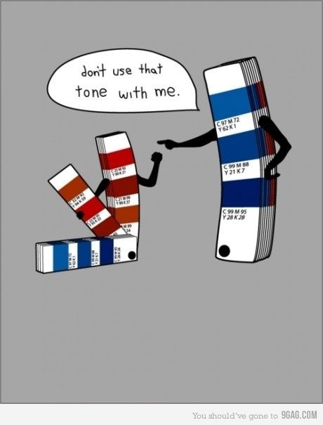
Pantone's Popularity
Color became standardized for industrial purposes when a printing company named Pantone began in the 1950’s. The name “Pantone” quite literally means all colors. Pantone created a color matching system and developed the “CMYK” printing process which helped the rest of the industrial world choose and create the colors they would be selling to consumers. Pantone has become ubiquitous, their color system became default all over the world. Lawrence Herbert, a chemist who took over Pantone after starting there as a chemist, was aware that color perception varies greatly, so he developed a way to standardize color that was correlated with the amount of each pigment used to create the color on paper. This ensured that no matter what the lighting was or the way each person saw the color, there was a specific formula for each color that corresponded with numbers and could be trusted not to deviate based on perception. The CMYK printing process supported this idea by providing four pigments, cyan, magenta, yellow and key black that were used in varying amounts to create a large array of other colors. Not all Pantone colors can be created with these four pigments, however they provided a solid base to mix most colors used for printing.
(Pantone Bridge and CMYK / Youtube)
Pantone began in the 1950’s but was not successful until Lawrence Herbert took it over after developing his color matching and printing systems. In the 1960’s Herbert introduced the systems he had developed and licensed to various printing companies in attempt to get them to sign royalty with him and was successful. Within two weeks he had signed 20 of the 21 printing companies he had contacted. By 1964 he had expanded his business from printing to design as well and came out with a “Four-Color Process Guide” and “Color Tint Selector.” Soon the 1970’s and 1980’s provided a new world for Pantone to profit off of, the digital world. In 1974 Pantone released its “Color Data System for computerized ink color formulation and matching.” Aside from engaging with the digital world, Pantone also dabbled with making art supplies during this period. Pantone kept up with all of the other significant technological advances in the 1980’s with it’s new Process Color Simulator in 1982 and by signing with major graphic and design software manufactures of programs including Macintosh and IBM-PC. Since the 1980’s Pantone has continued to expand and partner with a large number of digital art companies, computer hardware and software companies, and many more commercial companies. Although Pantone has expanded greatly since it’s beginning, one thing that has remained extremely popular all over the world is Pantone’s color matching chips.
 |
| (Lawrence Herbert and Pantone Chips/ Pintrest) |
Pantone’s “chips” which are small pieces of paper with a slight variation of a shade of a color on each have become famous worldwide. From Pantone’s extremely popular line of hospital scrubs in Japan to a Pantone-like color wheel of variations of the Queen Elizabeth’s outfits in a meme, it has become clear that Pantone’s color system has become current cultures all over the world’s method of choice when it comes to organizing and making colors. Pantone responds to the culture by naming colors after something they are highly associated with, for example the color “macaroni and cheese” which is a tan orange many have seen over and over at dinner time at home. Pantone chips are so ubiquitous Pantone has been able to patent and make money off the graphic of the chip itself.
  |
| (Twitter) (memegenerator.net) |
Aside from these “chips” that have gathered a lot of attention Pantone releases a color of the year every year, which is something a lot less people know about. At first this may seem rather insignificant. How can a company declaring a color of the year impact anything? Well, when the company that provides color palettes for some of the largest industries in the world thinks about the significance of and impact a color can or does have, and declares one as having some sort of meaning or significance, it trickles down into the industries that make everything we buy as consumers. After Pantone declared “Blue iris” as 2007’s color of the year, fashion designers released a lot more blue clothing and accessories than the previous year, and after they declared “Rose Quartz” as the color of the year in 2016, many became obsessed with a similar color named “millennial pink” which has become the color of choice for any product for many consumers in 2016 and 2917. Millennial pink became so popular it made headlines and was all over social media. Although it is clear Pantone declaring a color of the year has an impact, there are people like Micha Riss, a creative director at a design firm in New York who think it is not Pantone’s place to be declaring a color of the year because she sees them as a “technical service.” It is also true that there are companies like Coca-Cola who have a fixed color palette who are less affected by these “color forecasts,” however the impact it has on industries like the fashion industry who rely on varying colors to keep people interested and buying their products is harder to deny. Even if Pantone is a “technical service,” because it has such large cultural and industrial significance, how they talk about colors matters a lot to very many people.
 |
| (Pintrest) |
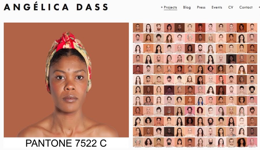 |
| (Linguaculturabrasil.com) |
Bibliography:
Plastics Color and Pantone reveal their ‘Colour of the Year’. Additives For Polymers[serial online]. April 2016;2016(4):6. Available from: Academic Search Complete, Ipswich, MA. Accessed May 21, 2018.
BINKLEY C. A Year in the Emerald City. Wall Street Journal - Eastern Edition [serial online]. December 6, 2012:D1, D4. Available from: Academic Search Complete, Ipswich, MA. Accessed May 22, 2018.
HALLIDAY H. The Complete Color Harmony, Pantone Edition: Expert Color Information for Professional Results. Library Journal [serial online]. March 2018;143(4):84. Available from: Academic Search Complete, Ipswich, MA. Accessed May 22, 2018.
Joss M. Pantone Introduces Pantone Plus: A New World of Color. Seybold Report: Analyzing Publishing Technologies [serial online]. May 10, 2010;10(9):12-14. Available from: Academic Search Complete, Ipswich, MA. Accessed May 22, 2018.
Britt J. color trends 2017. Ceramics Monthly [serial online]. November 2, 2016;:60-61. Available from: Academic Search Complete, Ipswich, MA. Accessed May 22, 2018.
Pasquarelli A. HOW PANTONE PICKS ITS COLOR OF THE YEAR. Advertising Age[serial online]. December 21, 2015;86(24):0025. Available from: Academic Search Complete, Ipswich, MA. Accessed May 22, 2018.
Dyson P. Pantone takes a low-tech approach to accurate Web colors. Seybold Report On Internet Publishing [serial online]. May 2000;4(9):28. Available from: Academic Search Complete, Ipswich, MA. Accessed May 22, 2018.
Quartz, A. (2018). How Pantone Became a Global Authority on Color. [online] The Atlantic. Available at: https://www.theatlantic.com/entertainment/archive/2015/11/how-pantone-became-a-pop-culture-icon/414043/ [Accessed 23 May 2018].
Quartz, A. (2018). How Pantone Became a Global Authority on Color. [online] The Atlantic. Available at: https://www.theatlantic.com/entertainment/archive/2015/11/how-pantone-became-a-pop-culture-icon/414043/ [Accessed 23 May 2018].
Pinterest. (2018). FUNNY. [online] Available at: https://www.pinterest.co.uk/pin/277182552038655289/ [Accessed 23 May 2018].
Twitter.com. (2018). Twitter. [online] Available at: https://twitter.com/PrecisionToday/status/641597176028753921/photo/1?tfw_site=theatlantic&ref_src=twsrc%5Etfw&ref_url=http%3A%2F%2Fwww.theatlantic.com%2Fentertainment%2Farchive%2F2015%2F11%2Fhow-pantone-became-a-pop-culture-icon%2F414043%2F [Accessed 23 May 2018].
Architectural Digest. (2018). The Process Behind Pantone's Color of the Year Isn't As Scientific As You'd Think | Architectural Digest. [online] Available at: https://www.architecturaldigest.com/story/behind-pantone-color-of-the-year-ultra-violet [Accessed 23 May 2018].
Hermanson, M. (2018). The 2018 Pantone Color of the Year Is Here, and It's Purple. [online] Zillow Porchlight. Available at: https://www.zillow.com/blog/2018-pantone-color-of-the-year-223079/ [Accessed 23 May 2018]
Dass, A. (2018). Humanae. [online] Angélica Dass. Available at: http://www.angelicadass.com/humanae-work-in-progress/ [Accessed 23 May 2018].
Linguaculturabrasil.com. (2018). Humanae - Angelica Dass. [online] Available at: https://www.linguaculturabrasil.com/en/item/49-humanae-angelica-dass [Accessed 23 May 2018].
Very interesting topic to choose to fit in to the overall theme. I feel like this gives the blog a lot of depth. Obviously a lot of effort was put in to research I would just be careful to avoid certain parts feeling like history summaries and make sure to include analysis throughout. A conclusion would be nice to have. The combination of images keeps the reader engaged and the whole piece feels very thorough.
ReplyDeleteI really liked the blog post and how it evolved from not just talking about Pantone. Would recommend editing a bit, there are awkward some sentences. Overall really cool information.
ReplyDeleteVery interesting post! I like how you applied color to a broader scale and discussed in-depth about the history and significance of Pantone. It would be nice to have some sort of in-text citation or footnote to see which information came from which source. Also, a conclusion would help tie all this cool information together.
ReplyDeleteInteresting post. Seems like you took a different approach in the "Material Production of Color". I like how you were interested in the digital production of colors rather than colors being produced out of earthly elements such as plants, animals, rocks, etc. You have a great structure to your piece, but would like to see more pictures showing the Pantone scale, or even a video that virtually walks us through the process of using and the creation of Pantone colors. Overall, I enjoy your approach to this piece. I think you need to go a tad deeper into your topic and create a more in depth beginning(introduction), middle(body) and end(conclusion).
ReplyDeleteYou have a long bibliography! I just recommend that you put citations within the text so us readers know what is your analysis and what is your research. Maybe add pictures to the beginning of the post as the bottom is a little heavy with them. The history and influence of Pantone was really interesting to read about, and the information on the paint chips was fun to learn.
ReplyDeleteDarrah, Your post presents many interesting points but I think you need to make it much clearer where your information is coming from. As Jasmine noted, you have a long bibliography but no citations. Citations give your reader guidance about where a particular kind of information can be found, and they are the only thing that make your bibliography useful or meaningful. So you need to cite the points which are not "common knowledge" (e.g. found in all kinds of sources) and are specific ideas or facts that come from a source. Who are these "many"that became "obsessed" with a color and the "many consumers" that you're referring to? That is a term that should be grounded in more quantified material -- is many 3 or 4 people or 5000 to 10,000? If you don't know, then you should perhaps consider rephrasing this or finding the citation that provides more information. I would encourage you to have someone edit your text a bit -- beyond the typos and some grammatical errors (e.g. "2917" and "it's" when you mean to use "its" (it's=contraction for "it is" and its= possessive (its color, its meaning, its significance -- so an apostrophe "it's" would mean "it is color" "it is meaning," "it is significance."). "Profit off of, " has a comma that doesn't belong there, and so on. I would also encourage you to say a few more things about your illustrations, particularly the one that seems to suggest Japanese scrubs and the Queen's outfits. It doesn't make any sense without explanation. How does the "color wheel" work? And what are the colors of the scrubs? It seems worth stating outright that Pantone, because of its prominence in printing, managed to corner a large portion of advertising and marketing that made it something of a "standard". I am assuming that this is the case, but you don't say that and perhaps -- if you think it is true -- you should. Hope these are helpful comments. ---Prof. Monahan
ReplyDelete